Mobile layouts
Machinon adapts every page to smaller screens rather than just shrinking the desktop layout, and it does that in two separate steps as the window narrows, not one. Widen or narrow your browser window past 979 pixels and the navigation bar itself changes; keep narrowing past 767 pixels and a further set of pages, forms and dialogs adapts on top of that. A tablet held between those two widths sees only the first change, not the second, so which one applies to you depends on exactly how narrow the screen is.
The compact mobile dashboard
On a phone, Domoticz doesn't show you the same dashboard as on desktop, scaled down. It automatically switches to its own compact mobile dashboard: your favorite devices, listed as rows with their controls right beside them, so you can flip a switch or check a sensor without opening the device.
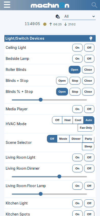
Domoticz's compact mobile dashboard, which lists your favorite devices as rows with their controls beside them. Domoticz picks this layout automatically on a phone.
The regular card dashboard is still there if you reach it another way, for example by widening the window past the phone breakpoint or opening it on a tablet; on a narrow screen it stacks into a single column instead of a grid.
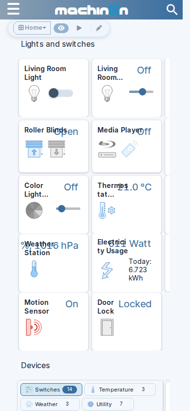
The dashboard on a phone, with the cards stacked into a single column.
Other pages on a phone
Every page in Domoticz gets the same mobile treatment, not just the dashboard: cards and tables stack into a single column, and controls stay full-width and easy to tap.
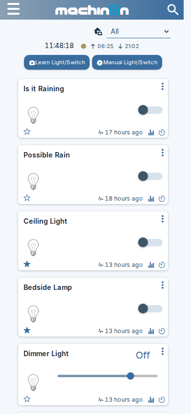
The Switches page.
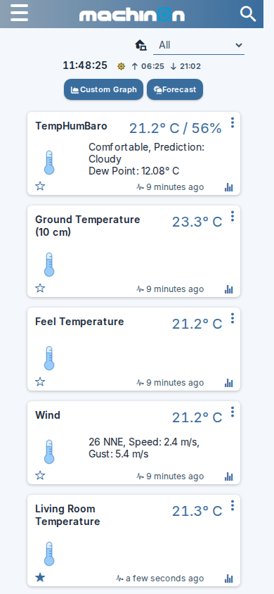
The Temperature page.
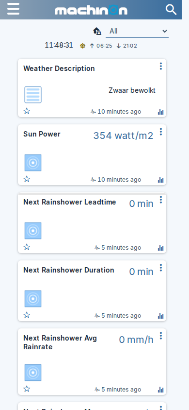
The Utility page.
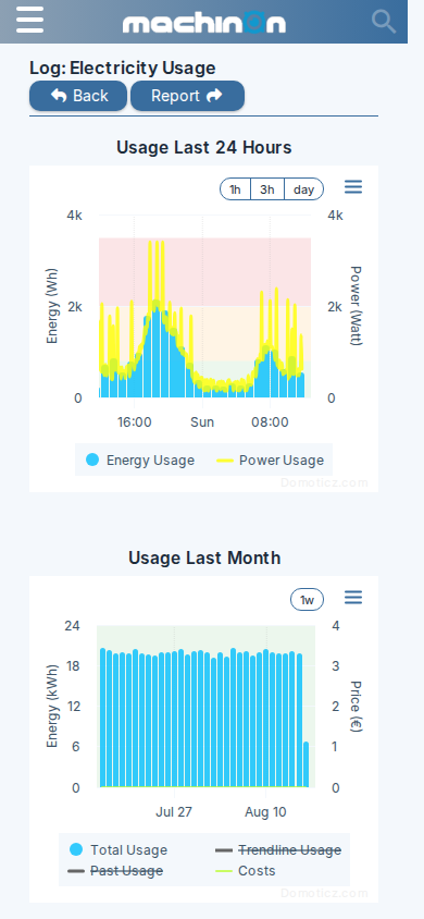
A device's Log page, with the chart scaled to fit the screen.
At 979px: the navigation bar switches
Once the window narrows past 979 pixels, the horizontal menu bar collapses into a hamburger icon in the top-left corner, and pages that don't fit a narrow screen switch to a stacked, single-column layout instead of trying to squeeze the desktop one down. This is the change a tablet in portrait orientation typically sees.
The full horizontal menu is still showing at 980 pixels wide, and the hamburger icon has fully replaced it by 960 pixels; the switch itself happens at 979.
At 767px: forms, tables, search and the Settings page adapt further
Narrower than 767 pixels, roughly phone width, a further set of changes kicks in on top of the 979px one above. A tablet that stays wider than this generally doesn't see this second set at all.
- The search box collapses to a small icon and expands when you tap it, rather than sitting open in the navigation bar all the time. Checked live: the search box is still open at 768 pixels wide, and fully collapsed at 767.
- Tables inside dialogs wrap their text instead of running wide and needing to scroll sideways.
- Edit forms (for devices, and similar dialogs) stack each field's label above the field, instead of placing them side by side, so the field itself can use the full width.
- The Settings page's tile grid (the one behind the Setup menu) packs its icons into narrower tiles so more of them fit on screen at once; their labels stay put, just in a smaller tile. Checked live: the tiles measure 250 pixels wide down to 768 pixels, and drop to 100 pixels wide at 767. (How many actually fit per row at a given width also depends on how much horizontal space the page has around the grid, not on the tile width alone, so that's deliberately left out here.)
- The Settings page's Apply Settings button also changes position here: instead of sitting at the top right next to the row of tabs (see Troubleshooting and FAQ for where it normally is), it becomes a floating bar fixed to the bottom of the screen, so it stays reachable without scrolling back up.